User interface (UI) design has evolved significantly over the years, driven by technology, user expectations, and changing design philosophies. One of the most debated topics in the design community is the contrast between flat design and skeuomorphism. Both styles shape how users interact with digital products, yet they reflect drastically different approaches.
In this blog, we’ll explore the core principles of flat design and skeuomorphism, weigh their pros and cons, and help you decide which approach aligns best with your project’s goals.
Understanding Flat Design
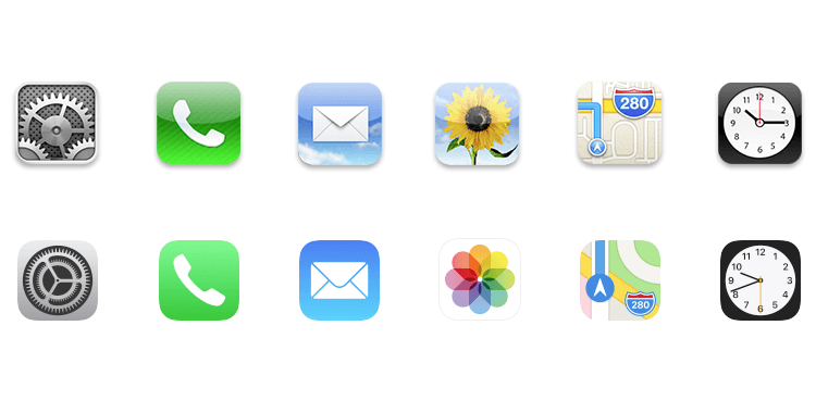
Flat design is a minimalist approach that emphasizes simplicity by removing unnecessary embellishments. It uses clean lines, bright colors, and basic shapes to create a sleek, modern aesthetic.
Key Characteristics of Flat Design:
- Minimal Use of Shadows and Textures: Flat design avoids drop shadows, gradients, and 3D effects.
- Bold Colors and Simple Typography: Bright, contrasting colors combined with simple, readable fonts.
- Focus on Functionality: Designs prioritize usability over visual complexity.
Origins and Popularity:
Flat design gained traction with the rise of responsive web design. Companies like Microsoft (with their Metro UI) and Google (Material Design) embraced this style to create interfaces that adapt well across devices.
What is Skeuomorphism?
Skeuomorphism takes inspiration from real-world objects, replicating their look and feel in digital interfaces. This design approach relies on textures, shadows, and gradients to make elements appear tangible and familiar.
Key Characteristics of Skeuomorphism:
- Realistic Textures and Shadows: Icons and buttons mimic their physical counterparts.
- Dimensional Depth: 3D effects, lighting, and detailed illustrations.
- Metaphors and Familiarity: Users feel more at ease navigating skeuomorphic designs because they resemble objects from the physical world.
Origins and Popularity:
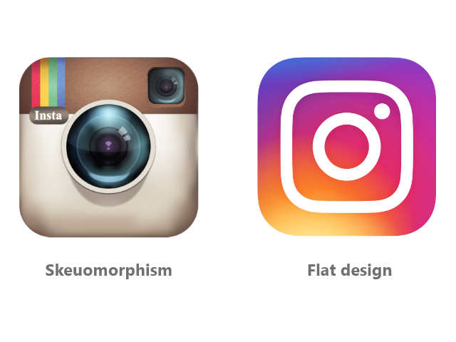
Apple popularized skeuomorphism in the early days of iOS, using leather textures for calendar apps and realistic book designs for e-readers. The goal was to help users transition from physical to digital environments.
Flat Design: Pros and Cons
Advantages of Flat Design:
- Faster Load Times: Simpler graphics lead to lighter pages and faster loading speeds.
- Responsive Across Devices: Minimalism enhances scalability, making it easier to create consistent experiences on various screen sizes.
- Modern Aesthetic: Flat design feels contemporary, appealing to users who prefer clean, uncluttered interfaces.
Disadvantages of Flat Design:
- Lack of Visual Hierarchy: Without shadows or gradients, it can be harder to distinguish interactive elements from static content.
- Potential Over-Simplification: Stripping away too much detail can make interfaces feel bland or impersonal.
Skeuomorphism: Pros and Cons
Advantages of Skeuomorphism:
- Intuitive for New Users: Realistic designs create familiarity, reducing the learning curve for non-tech-savvy users.
- Rich Visual Appeal: Skeuomorphic designs feel luxurious and engaging, often appealing to brands that value uniqueness.
- Clear Call to Action: Buttons and icons stand out due to their 3D nature and realistic shading.
Disadvantages of Skeuomorphism:
- Resource-Heavy: High-resolution textures and detailed elements can slow down websites and apps.
- Inconsistent Across Devices: Designs that mimic physical objects may not scale well, leading to usability issues on smaller screens.
- Outdated Feel: As digital literacy increases, skeuomorphism can appear outdated compared to the sleek, modern look of flat design.
Which Approach is Right for Your Project?
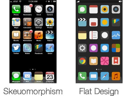
Choosing between flat design and skeuomorphism depends largely on your target audience, brand identity, and the type of product you're creating.
When to Use Flat Design:
- For Modern, Fast-Paced Digital Products: Apps and websites that prioritize speed and simplicity benefit from flat design.
- When Scalability is Key: Flat design adapts well to different screen sizes, making it ideal for responsive web projects.
- To Align with Minimalist Branding: Brands that value simplicity and elegance can reinforce their identity through flat design.
When to Use Skeuomorphism:
- For Niche or High-End Products: Luxury brands and specialized apps can leverage skeuomorphism to stand out.
- When Targeting Less Tech-Savvy Users: Products aimed at older audiences or those new to digital tools benefit from the familiarity of skeuomorphic elements.
- For Specific Use Cases: Apps that simulate real-world experiences (like music players or eBooks) often gain from skeuomorphic design.
Blending Both Styles: The Rise of Neumorphism
In recent years, a hybrid approach known as neumorphism has emerged. Neumorphism blends elements of flat design and skeuomorphism, creating soft, slightly raised components that feel modern yet familiar.
Key Traits of Neumorphism:
- Subtle Shadows and Highlights: Neumorphic elements appear slightly extruded, creating depth without the over-the-top realism of skeuomorphism.
- Minimalist with Depth: It retains the simplicity of flat design but adds a touch of dimension, offering the best of both worlds.
Best Practices for UI Design
Regardless of which design philosophy you choose, a few universal best practices apply:
- Prioritize User Experience: The design should enhance usability, not detract from it.
- Maintain Consistency: Stick to one design language to avoid confusing users.
- Test Across Devices: Ensure your design performs well on different screen sizes and resolutions.
- Focus on Accessibility: Whether using flat or skeuomorphic design, consider accessibility to create inclusive experiences.
Conclusion: Finding the Balance
Flat design and skeuomorphism each bring unique strengths to the table. While flat design aligns with modern aesthetics and performance, skeuomorphism offers familiarity and rich visuals. The right approach hinges on understanding your audience and design goals. Sometimes, blending elements from both worlds—or exploring neumorphism—can lead to a truly engaging and functional user interface.
Master the art of crafting intuitive interfaces and unforgettable user experiences with our Advanced UI/UX Design Course. Gain hands-on skills, elevate your career, and create designs that leave a lasting impact.
Enroll now at Kaarwan and take your expertise to the next level!
FAQs
1. What is the main difference between flat design and skeuomorphism?
Flat design emphasizes simplicity and minimalism, while skeuomorphism mimics real-world textures and objects.
2. Is flat design better than skeuomorphism for mobile apps?
Flat design is generally more scalable and performs better across devices, making it preferable for mobile apps.
3. Why did Apple move away from skeuomorphism?
Apple shifted to flat design for a cleaner, more modern look that aligns better with evolving user preferences and technology.
4. Can I combine flat design and skeuomorphism?
Yes, neumorphism blends elements of both, offering subtle depth while maintaining simplicity.
5. Which design style is more user-friendly?
Skeuomorphism can be more intuitive for beginners, while flat design appeals to experienced users due to its simplicity.